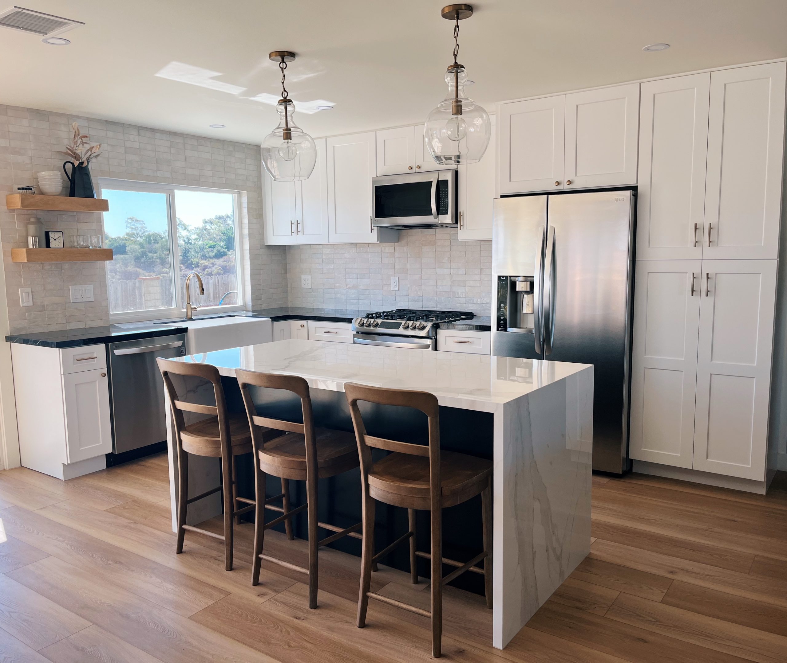
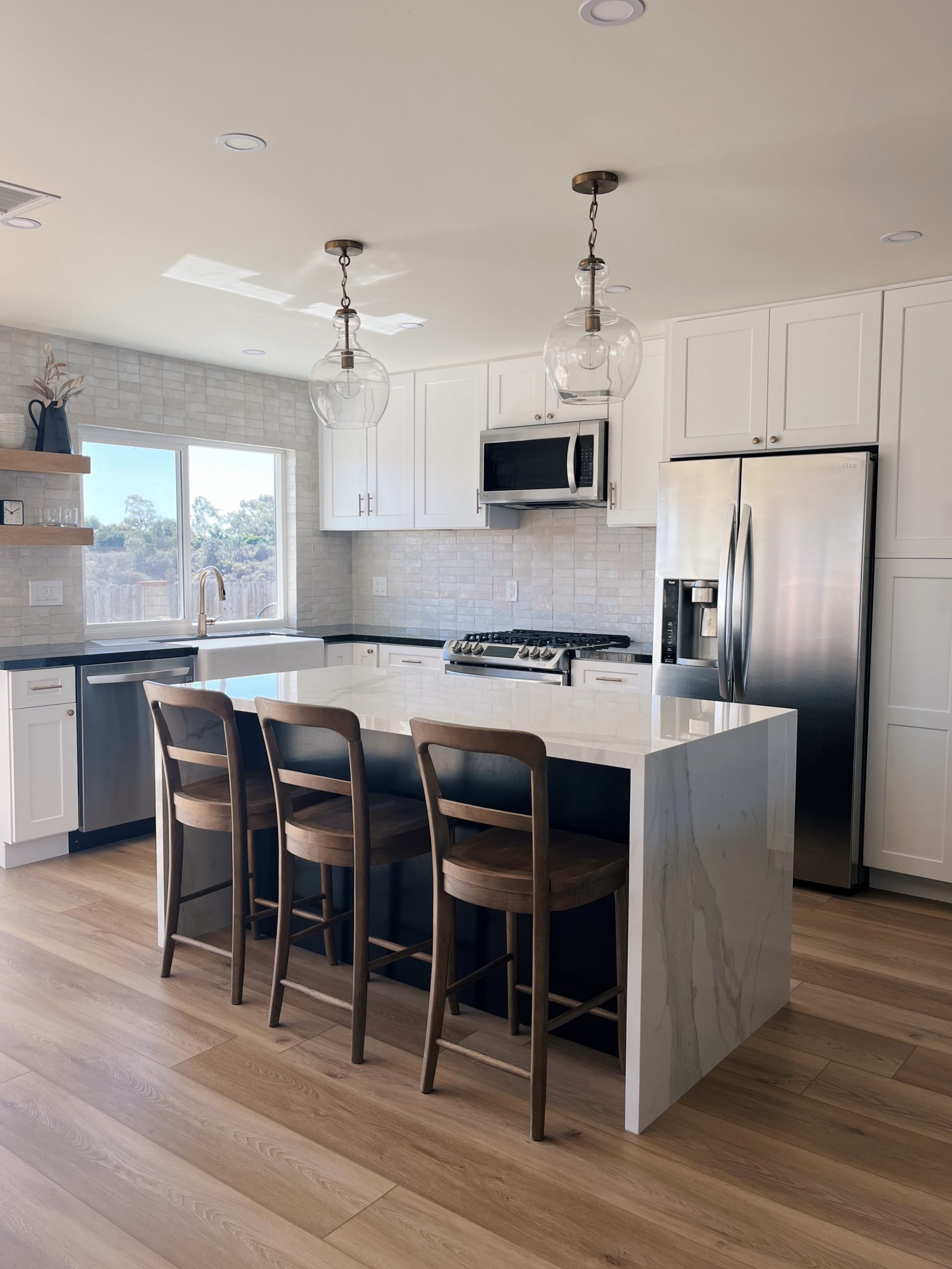
I have been meaning to post this kitchen before/after for a while now! Our house is *almost* done, so I wanted to start sharing a couple of the most fun transformations because I think there are a select few who might care about this stuff as much as I do.
For those playing catch up, we bought this cutie fixer upper back in June and spent the summer renovating it before we moved in in September. The house was in good condition but hadn’t been updated AT ALL since it was built in the 1970’s. And although the project was a little overwhelming at times, we had so much fun making this house our own.
I am not a design person and actually not really a visual person at all. (I learned in a college course that I am a kinesthetic learner which honestly explains a lot). HOWEVER, my strengths lie in my “I know what I like” tendencies. So while I can’t dream up a concept on my own, I can usually filter through choices quickly and decide on one that I’m obsessed with.
Most of our design inspiration came from the likes of Amber Lewis, Becki Owens, and Julia Marcum. I based several of my choices for the kitchen off of Becki Owen’s blog in particular. She is amazing.
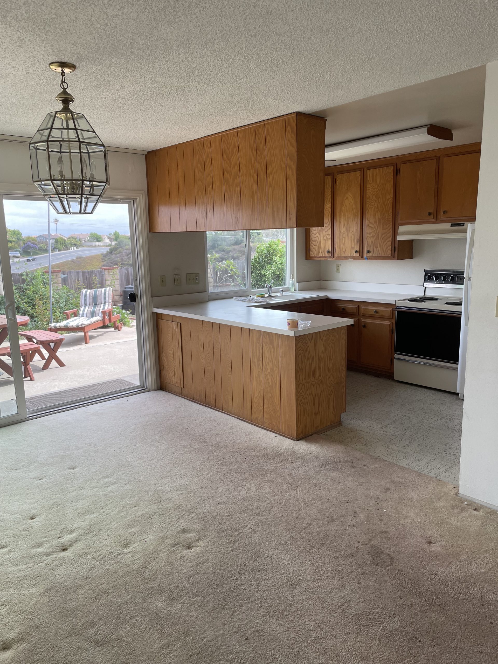
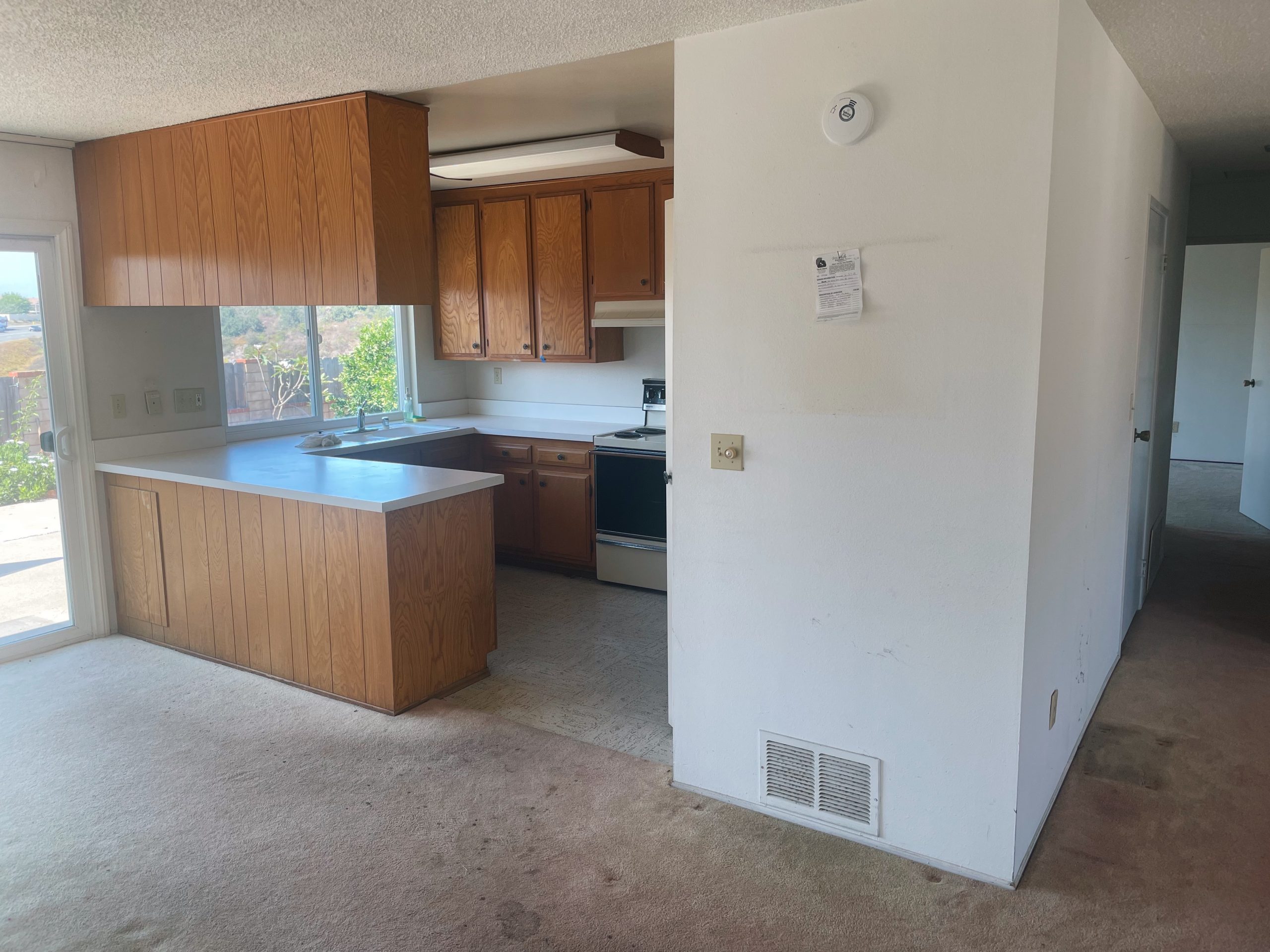
This is the kitchen the day we got the keys to the house.
The rental we’d be living all year was the same exact layout, so we had done a lot of “what would we change if we owned this house” leading up to buying one almost exactly like it, ha!
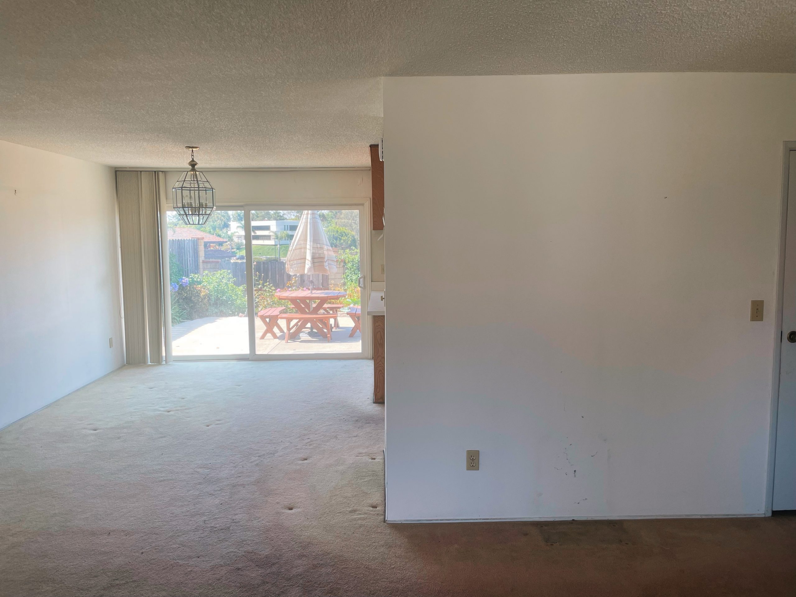
Tyler and I knew for sure that we wanted an open layout in the main area of the house. We actually didn’t make a ton of structural changes to the house, but the one big thing we did was knock out this wall that was dividing the kitchen/living area in order to open up the space.
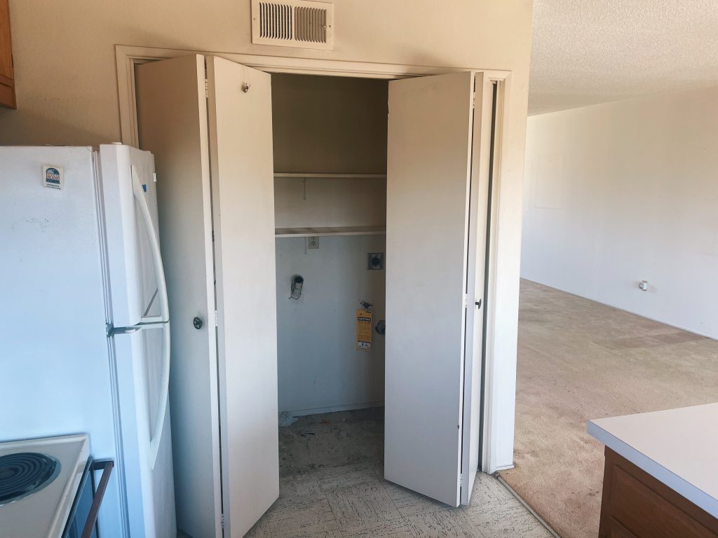
The washer and dryer were actually IN the kitchen which, in a closet-sized kitchen, is not the way, I assure you. (This was what we had in the rental, too, and it was a nightmare). So in addition to opening that wall up, we made the hall closet next to it as big as possible in order to fit the washer and dryer.
We did briefly look into keeping and restoring the current cabinets, but we realized after a bit of research that these cabinets in particular were going to require a lot of work and money to get them in good shape.
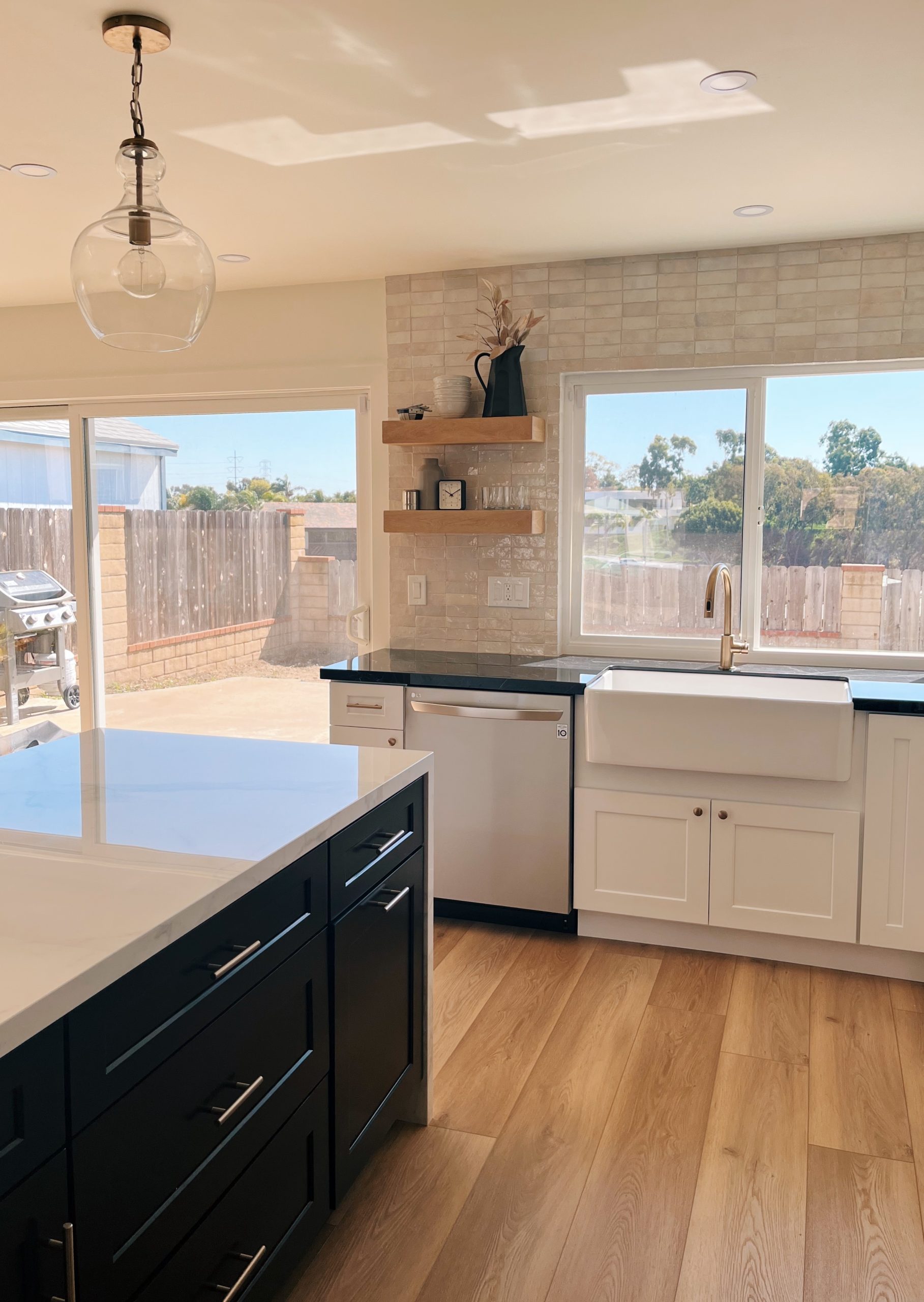
So we started from scratch! We went cheap for the cabinets and splurged on the countertops and backsplash. Balance, right?
We got the pre-fab cabinets from this wholesale place here in San Diego which was a great experience. We went in with all of the measurements and a general idea of what we wanted, and they sat down with us and did a little mock-up on the computer based on what they had in stock. This was even cheaper than doing it at Home Depot, and we have been really happy with them. They aren’t like state of the art or anything, but they are still really nice.
For the countertops, we went with glazed porcelain because it’s virtually indestructible: stain-resistant, heat-resistant, scratch-resistant, you get the idea. It felt like a no-brainer to us.
I, like any basic millennial woman, love the look of a clean white kitchen, but I didn’t want it to be so totally stark and sterile. So we decided to add in some black to the mix, with the black porcelain countertops along the sides of the kitchen. We painted the island black too to balance the contrast.
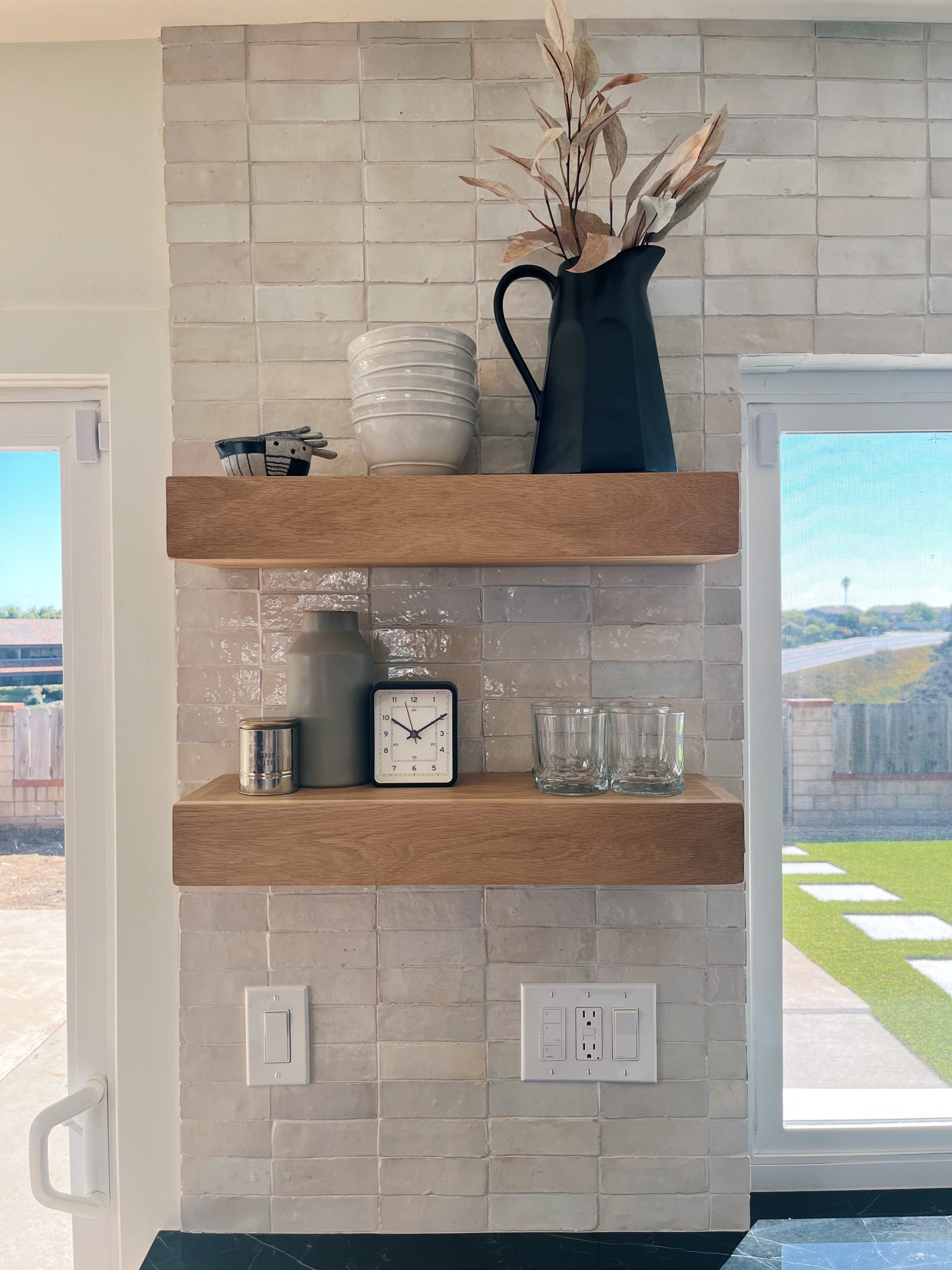
For the backsplash, we went with this glazed terracotta tile from Clé tile. I wanted it SO badly, but it ended up giving our tile guy an aneurysm I think, lol. There is a ton of variation in the cut and color of each tile, so the process was painstaking. I also wanted it stacked, rather than subway, so that made things even more difficult. It took a full week in total, with a break in the middle to wait for more to ship. I absolutely LOVE how the backsplash turned out though. The color is stunning, and it adds kind of old European rustic element to an otherwise modern kitchen (at least I think so anyway!). It’s one of my favorite parts of the house.
We softened things up with a subtle champagne faucet and hardware and some white oak floating shelves. The pendant lights were a Pottery Barn dupe from Wayfair.
In hindsight, I would make one big change: we decided to save a little money by not wiring the island for electrical, but I wish that we had so we could have placed the microwave down below in the island. I would rather have a range-hood over the stove and the microwave hidden, but that all would have added up quickly. Also, first-world problems, I know, please forgive me.
Links:
Backsplash: Zellige White Subway Glazed Moroccan Terracotta Tile
Floating Shelves: Custom White Oak from JThomasHomeGoods
Countertops: Magnifica Porcelain (Calacatta Super White and Nero Marquina)
Pendant Lights: Wayfair
Bar Stools: Pottery Barn
Faucet: Delta from Wayfair
Cabinet Hardware: Pulls and knobs from Amazon
Flooring: Coretec Pro Plus HD 9″ in Wiltshire Oak
It’s a pre-weekend pick me up: just a little note with links to the latest blog posts, what I’m reading lately, and products I’m obsessed with. Think of it as a friend dropping off a surprise latte in the morning--you know?
